
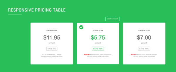
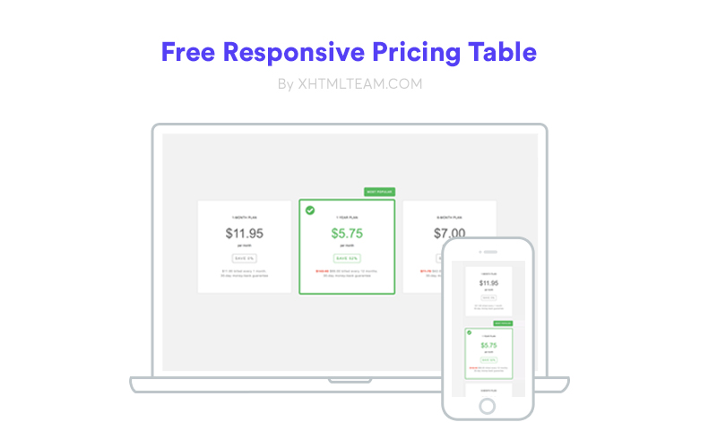
A simple, responsive pricing table converted from XD to HTML and CSS, fully customizable and easy to edit with basic HTML knowledge. Coded by XHTMLTEAM, this pricing table is perfect for personal use and can be downloaded for free. It’s optimized for responsiveness and ensures a professional look for your site.
Features
- Full Responsive
- HTML5 CSS3
- Easy to Customise
- Most browsers supported
- Free for Personal Use
CSS:
* {
   margin: 0;
   padding: 0;
}
html, body, div, span, applet, object, iframe, h1, h2, h3, h4, h5, h6, p, blockquote, pre, a, abbr, acronym, address, big, cite, code, del, dfn, em, img, ins, kbd, q, s, samp, small, strike, strong, sub, sup, tt, var, b, u, i, center, dl, dt, dd, ol, ul, li, fieldset, form, label, legend, table, caption, tbody, tfoot, thead, tr, th, td, article, aside, canvas, details, embed, figure, figcaption, footer, header, hgroup, menu, nav, output, ruby, section, summary, time, mark, audio, video {
   margin: 0;
   padding: 0;
   border: 0;
   font-size: 100%;
   font: inherit;
   vertical-align: baseline;
}
article, aside, details, figcaption, figure, footer, header, hgroup, nav, section {
   display: block;
}
html {
   font-size: 100%;
   -webkit-text-size-adjust: 100%;
   -ms-text-size-adjust: 100%;
}
*, *:before, *:after {
   -webkit-box-sizing: border-box;
   -moz-box-sizing: border-box;
   box-sizing: border-box;
}
body {
   background:#f2f2f2;
}
#container-main {
   width:100%;
   float:left;
  overflow:hidden;
}
.pricing-tables {
   width:100%;
   float:left;
   text-align:center;
   padding:50px 0;
}
.pricing-tables .container {
   width:100%;
   max-width:1260px;
   float:none;
   margin:0 auto;
   padding:0 30px;
}
.pricing-tables .article {
   width:30.30%;
   float:none;
   display:inline-block;
   text-align:center;
   vertical-align:middle;
   background:#ffffff;
   box-shadow:#e6e6e6 0 0 0 2px;
   border-radius:4px;
   position:relative;
   padding:60px 20px;
   margin:0 1.30% 40px 1.30%;
}
.pricing-tables .article p {
   font-family:"open_sanssemibold", Arial, Helvetica, sans-serif;
   font-size:12px;
   color:#999999;
   line-height:18px;
   letter-spacing:0.08em;
   padding:0;
   margin:0;
}
.pricing-tables .article p span {
   color:#ff190d;
   text-decoration:line-through;
}
.pricing-tables .article .small-text {
   width:100%;
   float:left;
   font-family:"open_sanssemibold", Arial, Helvetica, sans-serif;
   font-size:12px;
   color:#444444;
   line-height:16px;
   letter-spacing:0.06em;
   text-transform:uppercase;
   padding:0 0 30px 0;
}
.pricing-tables .article .price-text {
   width:100%;
   float:left;
   font-family:"open_sanssemibold", Arial, Helvetica, sans-serif;
   font-size:50px;
   color:#666666;
   line-height:1em;
   letter-spacing:normal;
   padding:0;
   margin:0 0 15px 0;
}
.pricing-tables .article .month {
   width:100%;
   float:left;
   font-family:"open_sanssemibold", Arial, Helvetica, sans-serif;
   font-size:12px;
   color:#444444;
   line-height:16px;
   padding:0 0 26px 0;
}
.pricing-tables .article .save-price {
   width:auto;
   float:none;
   display:inline-block;
   font-family:"open_sanssemibold", Arial, Helvetica, sans-serif;
   font-size:14px;
   color:#999999;
   line-height:18px;
   letter-spacing:2px;
   text-transform:uppercase;
   text-align:center;
   vertical-align:middle;
   border:1px solid #999999;
   border-radius:4px;
   padding:7px 10px 7px 10px;
   margin:0 0 25px 0;
}
.pricing-tables .article.selected {
   background:#ffffff;
   box-shadow:#27be56 0 0 0 6px;
   border-radius:1px;
}
.pricing-tables .article.selected .price-text {
   color:#27be56;
}
.pricing-tables .article.selected .save-price {
   color:#27be56;
   border-color:#27be56;
}
.pricing-tables .article.selected .icon-tick {
   width:38px;
   height:38px;
   float:left;
   text-indent:-9999px;
   background:url(../img/icon-tick-01.png) no-repeat top center;
   background-size:38px auto;
   position:absolute;
   top:20px;
   left:20px;
}
.pricing-tables .article.selected .most-popular {
   width:auto;
   height:36px;
   float:none;
   display:inline-block;
   font-family:"open_sansbold", Arial, Helvetica, sans-serif;
   font-size:10px;
   color:#ffffff;
   line-height:36px;
   letter-spacing:0.15em;
   text-transform:uppercase;
   vertical-align:middle;
   background:#27be56;
   border-radius:5px;
   padding:0 14px;
   position:absolute;
   top:-52px;
   right:-6px;
}
.pricing-tables .article-out {
   width:102.60%;
   float:left;
   text-align:center;
   padding:52px 0 0 0;
   margin:0 -1.30% -40px -1.30%;
}
@media only screen and (max-width:1023px) {
   .pricing-tables {
	   padding:40px 0;
  }
   .pricing-tables .article {
	   padding:40px 20px;
  }
   .pricing-tables .article .price-text {
	   font-size:40px;
  }
   .pricing-tables .article.selected {
	   box-shadow:#27be56 0 0 0 3px;
  }
   .pricing-tables .article.selected .icon-tick {
	   width:28px;
	   height:28px;
	   background-size:28px auto;
	   top:10px;
	   left:10px;
  }
   .pricing-tables .article.selected .most-popular {
	   right:-4px;
  }
   .pricing-tables .article-out {
	   padding:42px 0 0 0;
  }
}
@media only screen and (max-width:767px) {
   .pricing-tables {
	   padding:40px 0;
  }
   .pricing-tables .container {
	   max-width:380px;
	   padding:0 20px;
  }
   .pricing-tables .article {
	   width:100%;
	   padding:40px 10px;
	   margin:0 0 30px 0
  }
   .pricing-tables .article.selected {
	   margin-top:50px;
  }
   .pricing-tables .article-out {
	   width:100%;
	   padding:0;
	   margin:0 0 -30px 0;
  }
}
HTML:
<!doctype html>
<html lang="en">
<head>
<!-- downloaded from xhtmlteam.com -->
<meta charset="utf-8" />
<meta http-equiv="Content-Type" content="text/html; charset=utf-8" />
<meta name="apple-touch-fullscreen" content="YES">
<meta name="description" content="">
<meta name="keywords" content="">
<title>Sample</title>

<meta content="width=device-width, initial-scale=1.0, user-scalable=no, maximum-scale=1.0" name="viewport">
<link href="css/main.css" rel="stylesheet" type="text/css" />

</head>
<body>

<div id="container-main">

    <div class="pricing-tables">
    <div class="container">

        <div class="article-out">
        <div class="article">
        <div class="small-text">1-Month Plan</div>
        <div class="price-text">$11.95</div>
        <div class="month">per month</div>
        <div class="save-price">Save 0%</div>
        <p>$11.95 billed every 1 month.<br />30-day money-back guarantee</p>
        </div>

        <div class="article selected">
        <div class="small-text">1 Year Plan</div>
        <div class="price-text">$5.75</div>
        <div class="month">per month</div>
        <div class="save-price">Save 52%</div>
        <p><span>$143.40</span> $69.00 billed every 12 months.<br />30-day money-back guarantee</p>
        <div class="icon-tick">Tick</div>
        <div class="most-popular">Most Popular</div>
        </div>

        <div class="article">
        <div class="small-text">6-Month Plan</div>
        <div class="price-text">$7.00</div>
        <div class="month">per month</div>
        <div class="save-price">Save 41%</div>
        <p><span>$71.70</span> $42.00 billed every 6 months.<br />30-day money-back guarantee</p>
        </div>
        </div>

    </div>
    </div>

</div>

<script src="js/modernizr.js"></script>
<script src="js/jquery.min.js"></script>

</body>
</html>
Live Preview
You can view a live demo here.