When developers start building responsive websites, choosing between Tailwind CSS and Bootstrap is one of the most common decisions. Both are popular CSS frameworks but follow completely different design philosophies.
Bootstrap offers ready-made components and a consistent grid system. Tailwind CSS, on the other hand, provides a utility-first approach, allowing total control over design and layout without writing custom CSS from scratch.
This article compares Tailwind vs Bootstrap with detailed examples, pros and cons, and real-world code snippets to help you understand which framework suits your development style.
What Is Tailwind CSS?
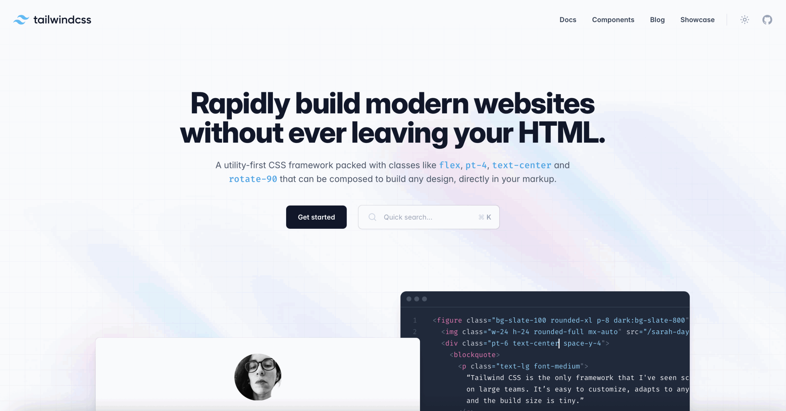
Tailwind CSS is a utility-first CSS framework designed to help developers build custom, responsive designs directly in HTML. Instead of pre-designed components, Tailwind provides low-level utility classes like flex, p-4, text-center, and bg-blue-500, which can be combined to create unique interfaces.
Advantages of Tailwind CSS
- Complete design freedom — no predefined UI look
- Faster prototyping with utility classes
- Easy customization using the tailwind.config.js file
- Excellent performance when combined with tools like PurgeCSS
- Built-in dark mode, responsive breakpoints, and modern design tokens
What Is Bootstrap?
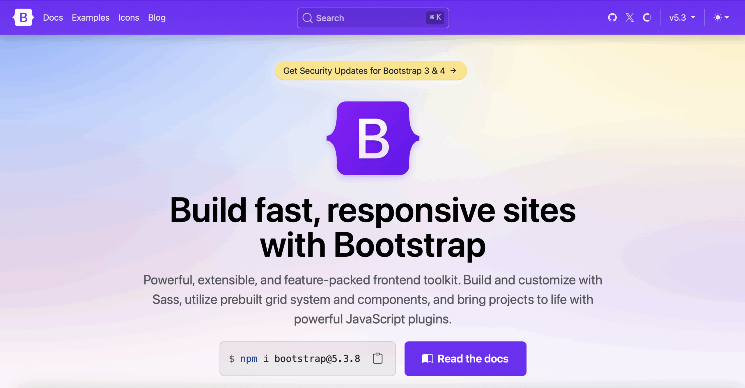
Bootstrap is a component-based front-end framework originally developed by Twitter. It provides pre-styled UI elements like buttons, navbars, modals, and grids — all designed to look consistent across browsers.
Developers who want a ready-to-use design system with minimal setup often choose Bootstrap.
Advantages of Bootstrap
- Pre-built components and layout system
- Responsive grid for mobile-first design
- Extensive documentation and community support
- Compatible with React, Angular, and Vue
- Built-in JavaScript components (dropdowns, modals, etc.)
Key Differences Between Tailwind and Bootstrap
| Feature | Tailwind CSS | Bootstrap |
|---|---|---|
| Design Philosophy | Utility-first | Component-based |
| Customization | Highly flexible | Limited to theme overrides |
| Learning Curve | Steeper at first | Easier for beginners |
| Default Design | Minimal | Predefined |
| Performance | Very light (with PurgeCSS) | Slightly heavier |
| JavaScript Support | None built-in | Built-in JS components |
| Responsive System | Utility classes for breakpoints | Grid-based system |
Tailwind is ideal for developers who enjoy building custom UIs, while Bootstrap is great for faster, template-based development.
Tailwind vs Bootstrap: Code Comparison
Let’s compare simple UI components — a responsive navigation bar and a button — to understand how both frameworks differ in syntax and structure.
Example 1: Responsive Navbar
Tailwind CSS Navbar
<nav class="bg-gray-800 p-4 flex items-center justify-between">
  <div class="text-white text-lg font-bold">MySite</div>
  <ul class="flex space-x-6">
    <li><a href="#" class="text-gray-300 hover:text-white">Home</a></li>
    <li><a href="#" class="text-gray-300 hover:text-white">About</a></li>
    <li><a href="#" class="text-gray-300 hover:text-white">Contact</a></li>
  </ul>
</nav>
Bootstrap Navbar
<nav class="navbar navbar-expand-lg navbar-dark bg-dark">
  <a class="navbar-brand" href="#">MySite</a>
  <div class="collapse navbar-collapse">
    <ul class="navbar-nav ml-auto">
      <li class="nav-item"><a class="nav-link" href="#">Home</a></li>
      <li class="nav-item"><a class="nav-link" href="#">About</a></li>
      <li class="nav-item"><a class="nav-link" href="#">Contact</a></li>
    </ul>
  </div>
</nav>
✅ Observation:
Bootstrap uses semantic class names and built-in layout behavior, while Tailwind requires utility classes for full control over spacing, colors, and responsiveness.
Example 2: Buttons Comparison
Tailwind Button
<button class="bg-blue-500 text-white px-4 py-2 rounded hover:bg-blue-600">
  Submit
</button>
Bootstrap Button
<button class="btn btn-primary">Submit</button>
✅ Observation:
Bootstrap simplifies the process with predefined classes, while Tailwind provides granular control over each styling aspect.
Responsive Design Capabilities
Both frameworks are responsive by design, but they handle responsiveness differently.
Tailwind CSS Responsive Design
Tailwind uses breakpoint prefixes like sm:, md:, lg:, and xl:. Developers can apply these directly in HTML.
<div class="text-base sm:text-lg md:text-xl lg:text-2xl">
  Responsive Text Example
</div>
Each breakpoint is customizable in the Tailwind config file, giving developers total control over screen widths and behavior.
Bootstrap Responsive Design
Bootstrap uses a 12-column grid system. It defines layouts using container and column classes such as col-sm-6, col-md-4, etc..
<div class="container">
  <div class="row">
    <div class="col-sm-6 col-md-4">Column 1</div>
    <div class="col-sm-6 col-md-8">Column 2</div>
  </div>
</div>
✅ Observation:
Bootstrap grids are easier for quick layouts, while Tailwind’s utility classes provide more flexibility for custom breakpoints.
Customization and Theming
Customization is one of the strongest aspects of Tailwind CSS and a common limitation in Bootstrap.
Tailwind Customization Example
Tailwind’s configuration file (tailwind.config.js) allows developers to define custom colors, spacing, and fonts.
module.exports = {
  theme: {
    extend: {
      colors: {
        brand: '#4F46E5',
      },
      spacing: {
        72: '18rem',
        84: '21rem',
      },
    },
  },
}
This setup gives developers complete control over the design system.
Bootstrap Customization Example
Bootstrap can be customized using SASS variables.
$theme-colors: (
  "primary": #4F46E5,
  "secondary": #6B7280
);
✅ Observation:
Bootstrap customization is simple but limited to its structure. Tailwind offers unlimited flexibility through configuration and theming.
Performance and File Size
Performance directly affects SEO and user experience.
Tailwind CSS Performance
Tailwind CSS might initially seem large because it includes all utility classes. However, when combined with PurgeCSS, unused styles are removed automatically during the build process.
Typical Tailwind production CSS file: 10–50 KB
Bootstrap Performance
Bootstrap includes many prebuilt components and JavaScript, which increases file size.
Typical Bootstrap CSS + JS bundle: 150–200 KB
✅ Observation:
Tailwind’s modular approach gives it a clear edge in performance and page loading speed.
Developer Experience
Tailwind Developer Experience
- You can design directly in your HTML without switching between CSS files.
- Class-heavy markup can be overwhelming at first but becomes faster over time.
- Works well with React, Vue, and modern frontend frameworks.
Bootstrap Developer Experience
- Easier for beginners; components look good without extra design work.
- Great for quick prototypes and dashboards.
- Limited flexibility unless you override default styles.
✅ Verdict:
Tailwind feels more modern and efficient for experienced developers, while Bootstrap remains perfect for beginners or quick builds.
Community and Ecosystem
Tailwind Ecosystem
- Strong open-source community
- Extensions like Tailwind UI, DaisyUI, and Flowbite
- Excellent support for Next.js, Laravel, and Vue.js
Bootstrap Ecosystem
- Established since 2011
- Thousands of prebuilt templates and themes
- Active GitHub and Stack Overflow community
Which One Should You Choose?
Your decision depends on your project type, timeline, and design goals.
| Project Type | Recommended Framework |
|---|---|
| Startup Landing Pages | Tailwind CSS |
| Corporate Websites | Bootstrap |
| Custom UI Web Apps | Tailwind CSS |
| Admin Dashboards | Bootstrap |
| Performance-Optimized Sites | Tailwind CSS |
| Quick Prototypes | Bootstrap |
Final Recommendation
- Choose Tailwind CSS if you want complete control, performance, and a modern UI workflow.
- Choose Bootstrap if you prefer ready-to-use components and a classic grid layout with minimal design effort.
Conclusion
Both Tailwind CSS and Bootstrap are powerful tools for building responsive, professional web designs. The right choice depends on how much control you want over design and how fast you need to deliver results.
Tailwind CSS is perfect for developers who enjoy creativity and flexibility.
Bootstrap remains a reliable choice for those who want simplicity and consistency.
If you need expert assistance in converting Figma, Framer, or custom designs into pixel-perfect HTML/CSS or WordPress themes, reach out to XHTMLTEAM — specialists in high-quality, responsive web conversions.