CSS continues to shape how modern websites look, feel, and behave. As we move closer to 2026, expectations around speed, responsiveness, accessibility, and design flexibility are higher than ever. Developers can no longer rely on outdated layouts or heavy frameworks alone. Smart, modern CSS tricks help build cleaner codebases, adaptive layouts, and future-ready interfaces that work smoothly across devices and screen sizes. This guide focuses on practical, production-ready CSS tricks developers should actively use when building 2026-ready websites.
Essential CSS Tricks for Modern Web Development (2026)
Below are 10 future-focused CSS tricks that developers should master to stay ahead in 2026. Each CSS trick includes explanation, example, and real-world use cases.
1. CSS Container Queries
Container queries allow styles to respond to a parent container’s size instead of the viewport. This CSS trick makes components truly reusable and independent from layout context.
Example:
@container (min-width: 400px) {
  .card {
    display: grid;
    grid-template-columns: 1fr 2fr;
  }
}
Use Case:
Perfect for design systems, dashboards, and card-based layouts where the same component appears in different sections with different widths.
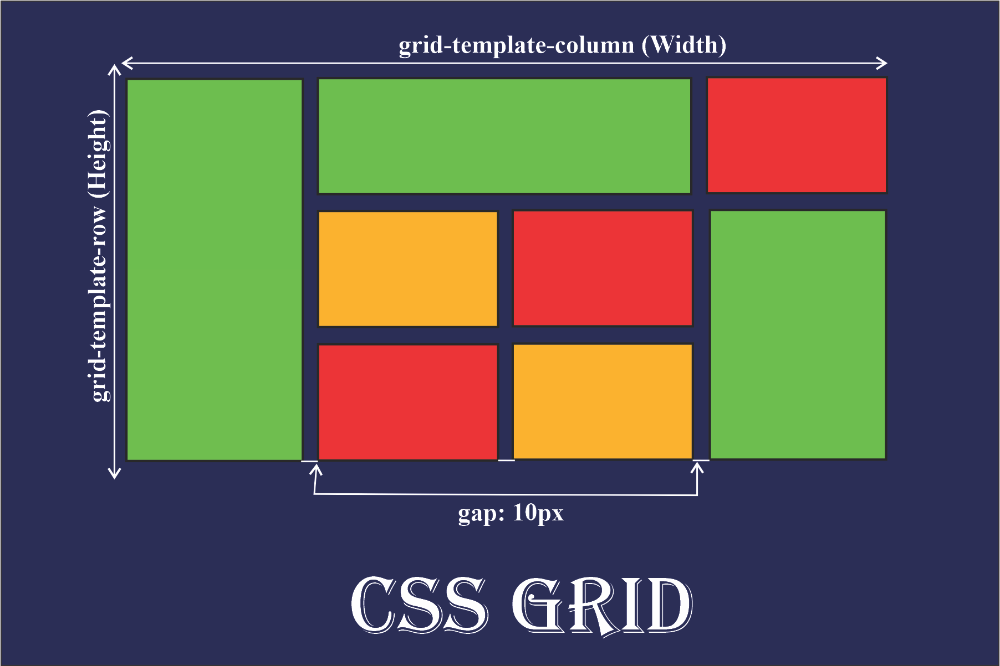
2. Modern CSS Grid with Subgrid
CSS Grid continues to evolve, and subgrid is one of the most useful CSS tricks for consistent alignment across nested layouts.
Example:
.parent {
  display: grid;
  grid-template-columns: repeat(3, 1fr);
}

.child {
  display: grid;
  grid-template-columns: subgrid;
}
Use Case:
Used in complex layouts like pricing tables, article lists, or admin panels where alignment consistency improves readability.
3. CSS Variables for Dynamic Design Systems
CSS variables make styling flexible and easier to maintain. This CSS trick reduces repetition and supports theme switching.
Example:
:root {
  --primary-color: #2563eb;
}

button {
  background: var(--primary-color);
}
Use Case:
Useful for dark/light modes, white-label projects, and scalable design systems where colors and spacing change frequently.
4. Logical Properties Instead of Physical Ones
Logical properties replace margin-left or padding-right with direction-aware properties. This CSS trick improves global and multilingual support.
Example:
.box {
  margin-inline-start: 1rem;
  padding-block: 2rem;
}
Use Case:
Ideal for international websites supporting RTL languages like Arabic or Hebrew without rewriting layouts.
5. Aspect-Ratio for Media Stability
The aspect-ratio property ensures stable layouts and avoids content shifts. This CSS trick helps reduce layout jumps.
Example:
.video {
  aspect-ratio: 16 / 9;
}
Use Case:
Used for video embeds, image cards, and ads where consistent sizing improves user experience and layout stability.
6. :has() Parent Selector
The :has() selector is one of the most powerful new CSS tricks. It allows styling parent elements based on child states.
Example:
.card:has(img:hover) {
  box-shadow: 0 10px 30px rgba(0,0,0,.2);
}
Use Case:
Great for interactive UI components, forms, and cards without relying on JavaScript.
7. Clamp() for Fluid Typography
clamp() enables responsive font sizes without multiple media queries. This CSS trick balances readability and scalability.
Example:
h1 {
  font-size: clamp(1.5rem, 5vw, 3rem);
}
Use Case:
Perfect for headlines, hero sections, and landing pages across phones, tablets, and large screens.
8. Modern Flexbox Alignment Tricks
Flexbox remains powerful when used with gap, auto margins, and alignment utilities.
Example:
.nav {
  display: flex;
  gap: 1rem;
}

.nav .cta {
  margin-left: auto;
}
Use Case:
Used in navigation bars, headers, and toolbars where alignment needs to stay clean and predictable.
9. Reduced Motion for Accessibility
This CSS trick respects user preferences and improves accessibility by reducing animations.
Example:
@media (prefers-reduced-motion: reduce) {
  * {
    animation: none;
    transition: none;
  }
}
Use Case:
Helpful for users sensitive to motion, ensuring inclusive and comfortable browsing experiences.
10. Modern CSS Performance Optimization
Performance-focused CSS tricks reduce render delay and simplify stylesheets.
Example:
@layer base, components, utilities;

@layer utilities {
  .hidden { display: none; }
}
Use Case:
Layered CSS improves maintainability, reduces overrides, and works well with modern build tools.
CSS Tricks for Responsive Design in 2026
Responsive design now goes beyond breakpoints. Modern CSS tricks like container queries, clamp(), flexible grids, and logical units allow layouts to adapt naturally. Instead of designing for devices, developers design for content. These CSS tricks reduce dependency on JavaScript while keeping layouts adaptive across foldables, ultra-wide monitors, and embedded web views.
CSS Tricks That Improve Performance
Efficient CSS directly impacts page speed. Using CSS variables, Grid instead of nested divs, and avoiding heavy animations reduces rendering overhead. Splitting CSS into layers and removing unused selectors keeps stylesheets lighter. These CSS tricks align well with modern Core Web Vitals expectations for 2026.
Accessibility-Focused CSS Tricks
Accessibility-friendly CSS tricks include focus-visible styles, reduced motion queries, high-contrast themes using variables, and scalable typography. When CSS handles accessibility early, developers avoid heavy retrofitting later. Clean CSS also supports assistive technologies more effectively.
Expert Insights from XHTMLTEAM
According to XHTMLTEAM experts:
“Modern CSS tricks allow us to deliver pixel-perfect HTML and CSS conversions without relying on heavy frameworks. As browsers evolve, clean CSS-first approaches help our clients achieve faster, accessible, and scalable websites.”
With years of experience in Figma-to-HTML and design-to-code workflows, XHTMLTEAM focuses on future-ready CSS practices tailored for long-term performance.
Conclusion
CSS in 2026 is smarter, more flexible, and more powerful than ever. Developers who adopt modern CSS tricks gain better control over layouts, performance, and accessibility without bloated code. From container queries to fluid typography, these techniques help build websites that scale with changing devices and user expectations.
Start applying these CSS tricks in your next project and future-proof your websites today. If you need expert-level CSS conversion, design-to-code services, or scalable frontend solutions, connect with XHTMLTEAM and build clean, modern, production-ready interfaces for 2026 and beyond.