Bootstrap Icons is an open-source icon library developed by the Bootstrap team. It is designed specifically for Bootstrap projects but can be used independently with any web framework. These icons are SVG-based and highly customizable, allowing developers to scale and style them as needed. For XHTMLTEAM and other front-end professionals, Bootstrap Icons offer a powerful way to enrich web interfaces with consistent and visually appealing icons.
Features of Bootstrap Icons
Bootstrap Icons comes with several notable features:
- Comprehensive Library: Over 2,000 icons covering various use cases.
- SVG Format: Vector-based for scalability and crisp rendering.
- Customizable: Easily styled using CSS.
- Lightweight: Minimal file size with SVG sprite support.
- Framework Agnostic: Can be used with any web project, not just Bootstrap.
- Open Source: Available on GitHub under the MIT license.
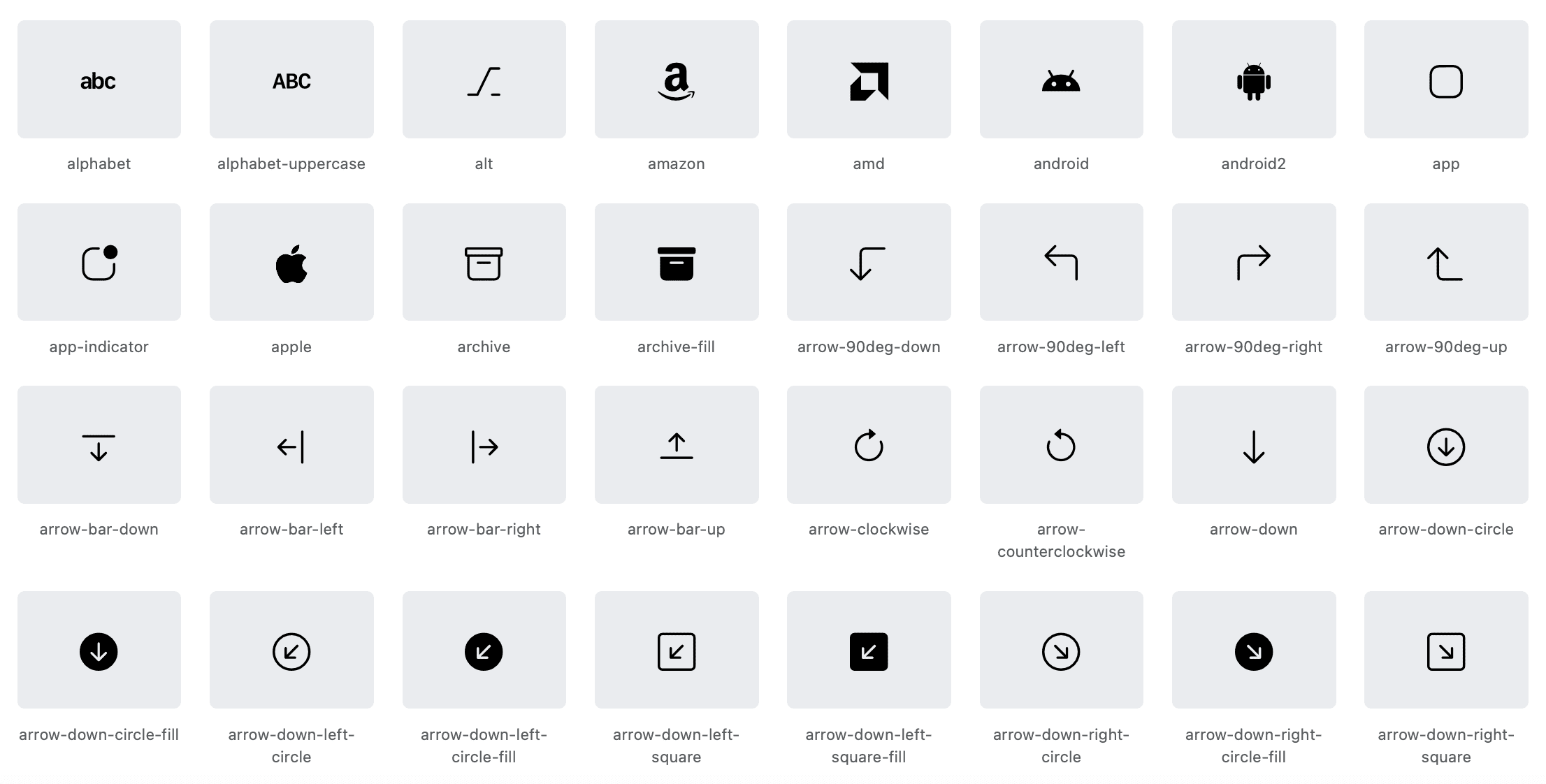
Icon Designs
Bootstrap Icons cover a wide variety of categories, including:
- UI elements (arrows, checkboxes, buttons)
- Social media icons
- Multimedia controls
- File types and document-related icons
- Alerts and notifications
- Navigation icons
- Form controls
The designs are clean, minimalist, and consistent with the Bootstrap design philosophy, making them ideal for professional-grade websites.
Bootstrap Icons CDN
Using Bootstrap Icons via CDN is one of the easiest ways to integrate them into a project. Simply include the CDN link in the <head> section of your HTML:
<link rel="stylesheet" href="https://cdn.jsdelivr.net/npm/bootstrap-icons@1.10.5/font/bootstrap-icons.css">
There are multiple ways to install Bootstrap Icons:
1. CDN
Add the CDN link as shown above for quick integration.
2. NPM
Install using Node Package Manager:
npm install bootstrap-icons
Then include it in your project via your build system.
3. Manual Download
Download the icon package from the official GitHub repository. Extract the files and include them in your project’s css or fonts directory.
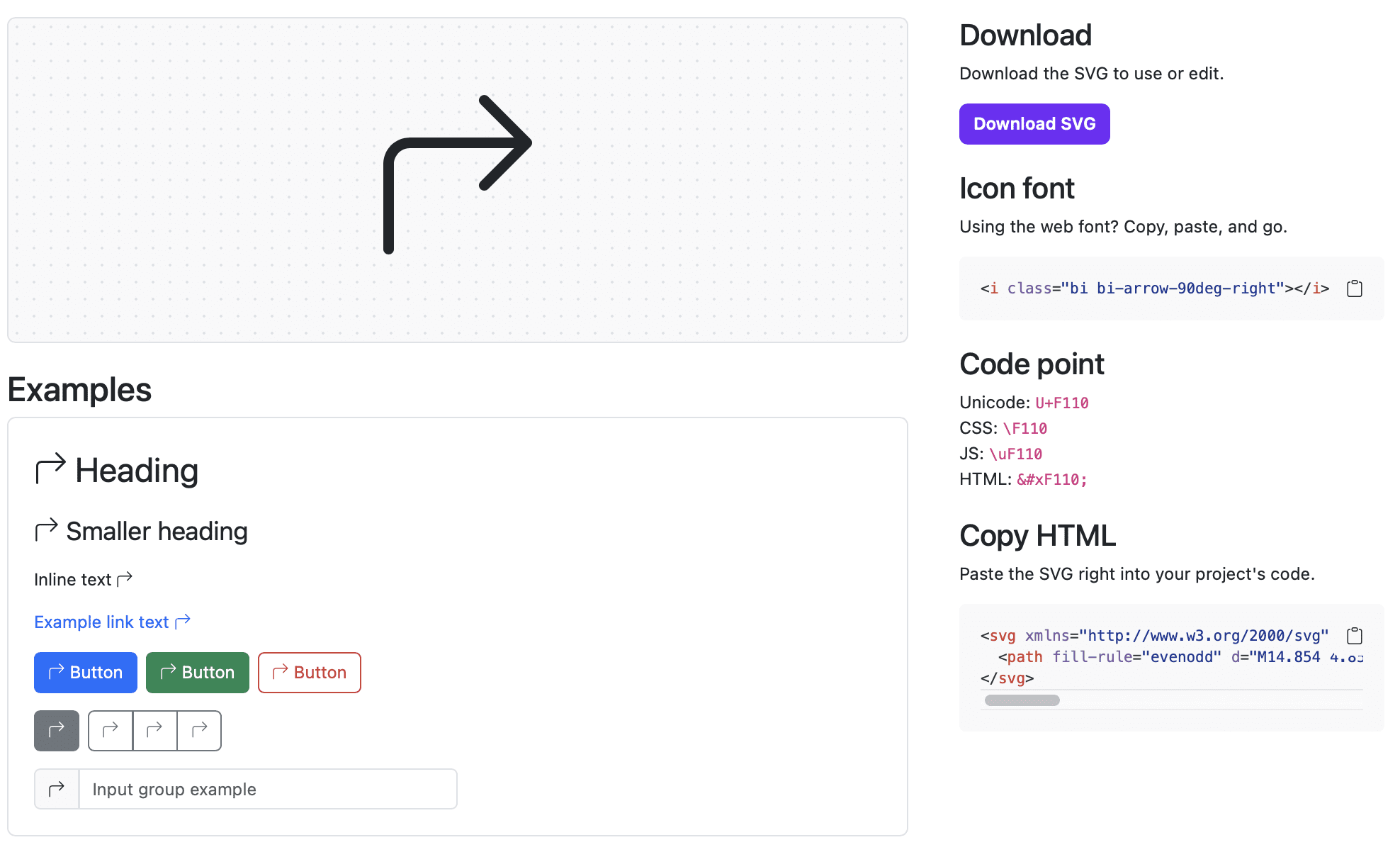
Using Bootstrap Icons in HTML
After including the stylesheet via CDN or other methods, you can use an icon by placing an <i> or <span> tag with a biclass:
<i class="bi bi-alarm"></i>
You can also use <svg> tags directly for more control:
<svg class="bi" width="16" height="16" fill="currentColor">
  <use xlink:href="bootstrap-icons.svg#alarm"/>
</svg>
Icon Sprite
The SVG sprite method uses a single file that contains all icons, referenced using the use element. This improves performance by reducing HTTP requests.
<svg class="bi" width="32" height="32" fill="currentColor">
  <use xlink:href="sprites/bootstrap-icons.svg#heart-fill"/>
</svg>
To implement icon sprite:
- Download
bootstrap-icons.svgfrom the GitHub repo. - Place it in your public directory.
- Reference individual icons using their IDs.
Styling Bootstrap Icons
You can style Bootstrap Icons with CSS just like any other HTML element:
i.bi {
  color: #007bff;
  font-size: 24px;
}
They also respond to utility classes in Bootstrap:
<i class="bi bi-chat-dots-fill text-success fs-4"></i>
You can rotate, scale, and transform them easily using utility classes or custom styles.
Accessibility
Accessibility is crucial in web development. Bootstrap Icons support ARIA attributes to enhance screen reader compatibility.
<i class="bi bi-exclamation-circle" role="img" aria-label="Warning"></i>
Use semantic roles and labels to describe icon purpose for screen readers. Avoid relying on icons alone for conveying information.
Integration with Bootstrap Framework
Bootstrap Icons work seamlessly with the Bootstrap framework. You can use them in buttons, alerts, modals, navbars, and more.
<button class="btn btn-primary">
  <i class="bi bi-download"></i> Download
</button>
They’re also great for dashboard UIs, forms, and e-commerce interfaces.
GitHub Repository
The official GitHub repository is the main source for updates, issues, and contributions:
- Link: https://github.com/twbs/icons
- License: MIT
- Contributions: You can suggest new icons or improvements via GitHub issues and pull requests.
Customization & Theming
You can customize Bootstrap Icons by changing:
- Color
- Size
- Fill
- Stroke
- Shadows
- Hover states
Icons can be combined or animated with custom styles or JavaScript.
Bootstrap Icons Templates and Resources
Here are some useful templates and icon collections:
Popular Use Cases for XHTMLTEAM
At XHTMLTEAM, we use Bootstrap Icons in:
- Admin dashboards
- E-commerce websites
- Landing pages
- Custom CMS systems
- Email templates
Icons help us deliver better UI/UX without compromising performance.
Comparison Table
| Feature | Bootstrap Icons | Font Awesome | Material Icons |
|---|---|---|---|
| Format | SVG | SVG/Web Font | SVG/Web Font |
| Framework Specific | Bootstrap | No | |
| Icon Count | 2,000+ | 7,000+ | 2,000+ |
| Open Source | Yes | Partially | Yes |
| Customization | Easy | Medium | Easy |
| CDN | Yes | Yes | Yes |
Final Thoughts
Bootstrap Icons are a powerful addition to any modern web project. Their simplicity, scalability, and integration with Bootstrap make them a go-to choice for XHTMLTEAM. Whether you’re working on a personal blog or an enterprise application, Bootstrap Icons provide the flexibility and clarity your UI needs.
For expert integration, theming, or icon customization services, contact XHTMLTEAM—we’re here to help you build sleek, accessible, and high-performing websites.
Keywords: Bootstrap Icons, Bootstrap Icons CDN, how to use Bootstrap Icons, SVG icon library, Bootstrap icon styling, Bootstrap Icons tutorial, install Bootstrap Icons, Bootstrap Icons accessibility, Bootstrap Icons GitHub, Bootstrap Icons integration, Bootstrap icon sprite, Bootstrap icon templates, free Bootstrap icons, Bootstrap Icons for web development, Bootstrap Icons examples, XHTMLTEAM Bootstrap Icons guide, Bootstrap Icons with HTML, icon libraries for Bootstrap, Bootstrap UI icons.