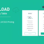
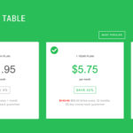
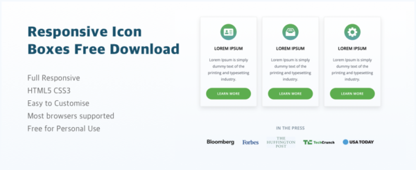
Download these free, fully responsive icon boxes for personal use. They’re easy to edit with just basic HTML knowledge, making them perfect for quick customization. Ideal for enhancing your website design with clean, functional icon boxes that work seamlessly across devices. Get your free download now!
Features
- Full Responsive
- HTML5 CSS3
- Easy to Customise
- Most browsers supported
- Free for Personal Use
CSS:
@font-face {
  font-family: 'open_sansregular';
  src: url('../webfonts/opensans-regular-webfont.eot');
  src: url('../webfonts/opensans-regular-webfont.eot?#iefix') format('embedded-opentype'),
         url('../webfonts/opensans-regular-webfont.woff') format('woff'),
         url('../webfonts/opensans-regular-webfont.ttf') format('truetype'),
         url('../webfonts/opensans-regular-webfont.svg#open_sansregular') format('svg');
  font-weight: normal;
  font-style: normal;
}

@font-face {
  font-family: 'open_sanssemibold';
    src: url('../webfonts/opensans-semibold-webfont.eot');
    src: url('../webfonts/opensans-semibold-webfont.eot?#iefix') format('embedded-opentype'),
         url('../webfonts/opensans-semibold-webfont.woff') format('woff'),
         url('../webfonts/opensans-semibold-webfont.ttf') format('truetype'),
         url('../webfonts/opensans-semibold-webfont.svg#open_sanssemibold') format('svg');
    font-weight: normal;
    font-style: normal;
}

@font-face {
  font-family: 'open_sansbold';
    src: url('../webfonts/opensans-bold-webfont.eot');
    src: url('../webfonts/opensans-bold-webfont.eot?#iefix') format('embedded-opentype'),
         url('../webfonts/opensans-bold-webfont.woff2') format('woff2'),
         url('../webfonts/opensans-bold-webfont.woff') format('woff'),
         url('../webfonts/opensans-bold-webfont.ttf') format('truetype'),
         url('../webfonts/opensans-bold-webfont.svg#open_sansbold') format('svg');
    font-weight: normal;
    font-style: normal;
}

* {
  margin: 0;
  padding: 0;
}

html, body, div, span, applet, object, iframe, h1, h2, h3, h4, h5, h6, p, blockquote, pre, a, abbr, acronym, address, big, cite, code, del, dfn, em, img, ins, kbd, q, s, samp, small, strike, strong, sub, sup, tt, var, b, u, i, center, dl, dt, dd, ol, ul, li, fieldset, form, label, legend, table, caption, tbody, tfoot, thead, tr, th, td, article, aside, canvas, details, embed, figure, figcaption, footer, header, hgroup, menu, nav, output, ruby, section, summary, time, mark, audio, video {
  margin: 0;
  padding: 0;
  border: 0;
  font-size: 100%;
  font: inherit;
  vertical-align: baseline;
}

article, aside, details, figcaption, figure, footer, header, hgroup, nav, section {
  display: block;
}

html {
  font-size: 100%;
  -webkit-text-size-adjust: 100%;
  -ms-text-size-adjust: 100%;
}

*, *:before, *:after {
  -webkit-box-sizing: border-box;
  -moz-box-sizing: border-box;
  box-sizing: border-box;
}

body {
  font-family: 'Open Sans', sans-serif;
  font-weight: 400;
  font-size: 15px;
  color: #666666;
  line-height: 24px;
}

.container-main {
  width: 100%;
  height: 100%;
  float: left;
  background: #ffffff;
  background: -webkit-linear-gradient(#ffffff, #f2f7fc);
  background: -o-linear-gradient(#ffffff, #f2f7fc);
  background: -moz-linear-gradient(#ffffff, #f2f7fc);
  background: linear-gradient(#ffffff, #f2f7fc);
  filter: progid:DXImageTransform.Microsoft.gradient( startColorstr='#ffffff', endColorstr='#f2f7fc', GradientType=0);
  overflow: auto;
  overflow-x: hidden;
  position: fixed;
  top: 0;
  left: 0;
  padding: 0 0!important;
}

.container-main .container-in {
  width: 100%;
  float: left;
  padding: 100px 0;
}

.container-main .container {
  width: 100%;
  max-width: 1200px;
  margin: 0 auto;
  padding: 0 30px;
}

@media only screen and (max-width: 991px) {
  .container-main .container-in {
    padding: 70px 0;
  }
}

@media only screen and (max-width: 767px) {
  .container-main .container-in {
    padding: 50px 0;
  }

  .container-main .container {
    max-width: 540px;
    padding: 0 20px;
  }
}

.feature-list {
  width: 100%;
  float: left;
  text-align: center;
}

.feature-list .heading-txt {
  width: 100%;
  float: left;
  padding: 0 0 100px 0;
}

.feature-list .heading-txt h2 {
  font-family: "open_sansregular", Arial, Helvetica, sans-serif;
  font-size: 42px;
  color: #212121;
  line-height: 1.2em;
  padding: 0 0 30px 0;
  margin: 0;
}

.feature-list .heading-txt p {
  font-family: "open_sansregular", Arial, Helvetica, sans-serif;
  font-size: 20px;
  color: #5f646f;
  line-height: 30px;
  letter-spacing: 0.02em;
  padding: 0 0 20px 0;
  margin: 0;
}

.feature-list .heading-txt p:last-child {
  padding-bottom: 0;
}

.feature-list .heading-txt aside {
  width: 100%;
  max-width: 780px;
  float: none;
  display: inline-block;
  vertical-align: top;
}

.feature-list .article {
  width: 30.77%;
  float: none;
  display: inline-block;
  vertical-align: top;
  border: 1px solid #e1e1e1;
  box-shadow: rgba(0, 0, 0, 0.10) 0 8px 20px;
  border-radius: 3px;
  position: relative;
  padding: 30px 25px 80px 25px;
  margin: 0 1.1% 2.56% 1.1%;
}

.feature-list .article .icon {
  width: 70px;
  height: 70px;
  float: none;
  display: inline-block;
  vertical-align: top;
  line-height: 68px;
  text-align: center;
  border-radius: 70px;
  background: #5ead52;
  background: -webkit-linear-gradient(#5ead52, #5ba2a7);
  background: -o-linear-gradient(#5ead52, #5ba2a7);
  background: -moz-linear-gradient(#5ead52, #5ba2a7);
  background: linear-gradient(#5ead52, #5ba2a7);
  filter: progid:DXImageTransform.Microsoft.gradient( startColorstr='#5ead52', endColorstr='#5ba2a7', GradientType=0);
  margin: 0 0 24px 0;
}

.feature-list .article img {
  max-width: 100%;
  max-height: 41px;
  vertical-align: middle;
  color: #fff;
}

.feature-list .article h3 {
  font-family: "open_sanssemibold", Arial, Helvetica, sans-serif;
  font-size: 18px;
  color: #000000;
  line-height: 24px;
  text-transform: uppercase;
  padding: 0 0 24px 0;
}

.feature-list .article h3 a {
  color: #000000;
  text-decoration: none;
}

.feature-list .article h3 a:hover {
  color: #5ead4e;
}

.feature-list .article p {
  font-family: "open_sansregular", Arial, Helvetica, sans-serif;
  font-size: 16px;
  color: #5f646f;
  line-height: 28px;
  padding: 0 0 24px 0;
  margin: 0;
}

.feature-list .article p strong {
  font-family: "open_sanssemibold", Arial, Helvetica, sans-serif;
}

.feature-list .article p a {
  color: #5f646f;
  text-decoration: none;
}

.feature-list .article p a:hover {
  color: #5ead4e;
}

.feature-list .article p:last-child {
  padding-bottom: 0;
}

.feature-list .article .btn {
  width: 100%;
  float: none;
  display: inline-block;
  font-weight: normal;
  font-family: "open_sanssemibold", Arial, Helvetica, sans-serif;
  font-size: 14px;
  color: #ffffff;
  line-height: 20px;
  letter-spacing: 0.06em;
  text-align: center;
  text-decoration: none;
  text-transform: uppercase;
  white-space: normal;
  vertical-align: middle;
  filter: 0;
  background: #5ead4e;
  border: 2px solid #5ead4e;
  border-radius: 100px;
  box-shadow: none;
  position: relative;
  cursor: pointer;
  overflow: hidden;
  outline: 0;
  -webkit-appearance: none;
  -moz-appearance: none;
  appearance: none;
  padding: 13px 20px 13px 20px;
}

.feature-list .article .btn:hover, .feature-list .article .btn:focus, .feature-list .article .btn:active, .feature-list .article .btn:active:focus, .feature-list .article .btn.active, .feature-list .article .btn.active:focus {
  color: #5ead4e;
  text-decoration: none;
  background: none;
  outline: 0;
}

.feature-list .article .btn.disabled, .feature-list .article .btn[disabled], .feature-list .article fieldset[disabled] .btn {
  cursor: not-allowed;
  filter: alpha(opacity=65);
  -webkit-box-shadow: none;
  box-shadow: none;
  opacity: .65;
}

.feature-list .article a.btn.disabled, .feature-list .article fieldset[disabled] a.btn {
  pointer-events: none;
}

.feature-list .article .btn-out {
  width: 100%;
  float: left;
  position: absolute;
  bottom: 30px;
  left: 0;
  padding: 0 25px;
}

.feature-list .article-out {
  width: 102.56%;
  float: left;
  margin: 0 -1.28% -2.56% -1.28%;
}

.feature-list .article-list {
  width: 100%;
  max-width: 780px;
  float: none;
  display: inline-block;
  vertical-align: middle;
  margin: 0 0 80px 0;
}

.feature-list .article-list:last-child {
  margin-bottom: 0;
}

@media only screen and (max-width: 991px) {
  .feature-list .heading-txt {
    padding: 0 0 70px 0;
  }

  .feature-list .heading-txt h2 {
    font-size: 34px;
    padding: 0 0 25px 0;
  }

  .feature-list .heading-txt p {
    font-size: 18px;
    line-height: 26px;
    padding: 0 0 20px 0;
  }

  .feature-list .article {
    width: 30.70%;
    padding: 30px 20px 76px 20px;
  }

  .feature-list .article .icon {
    margin: 0 0 25px 0;
  }

  .feature-list .article h3 {
    font-size: 16px;
    line-height: 22px;
    padding: 0 0 25px 0;
  }

  .feature-list .article p {
    font-size: 15px;
    line-height: 24px;
    padding: 0 0 25px 0;
  }

  .feature-list .article .btn {
    font-size: 13px;
    line-height: 18px;
    padding: 12px 20px 12px 20px;
  }

  .feature-list .article .btn-out {
    padding: 0 20px;
  }

  .feature-list .article-list {
    margin: 0 0 60px 0;
  }
}

@media only screen and (max-width: 767px) {
  .feature-list .heading-txt {
    padding: 0 0 50px 0;
  }

  .feature-list .heading-txt h2 {
    font-size: 28px;
    padding: 0 0 20px 0;
  }

  .feature-list .heading-txt p {
    font-size: 16px;
    line-height: 24px;
  }

  .feature-list .article {
    width: 100%;
    max-width: 230px;
    padding: 30px 20px 76px 20px;
    margin: 0 8px 20px 8px;
  }

  .feature-list .article .icon {
    margin: 0 0 20px 0;
  }

  .feature-list .article h3 {
    padding: 0 0 20px 0;
  }

  .feature-list .article p {
    padding: 0 0 20px 0;
  }

  .feature-list .article-out {
    width: 100%;
    margin: 0 0 -20px 0;
  }

  .feature-list .article-list {
    width: 100%;
    max-width: 100%;
    margin: 0 0 40px 0;
  }
}

.client-logo {
  width: 100%;
  float: left;
  overflow: hidden;
}

.client-logo h2 {
  font-family: "open_sanssemibold", Arial, Helvetica, sans-serif;
  font-size: 18px;
  color: #7d909d;
  line-height: 26px;
  text-transform: uppercase;
  letter-spacing: 0.04em;
  padding: 0 0 25px 0;
  margin: 0;
}

.client-logo h2:last-child {
  padding-bottom: 0;
}

.client-logo ul {
  width: auto;
  float: none;
  display: inline-block;
  vertical-align: middle;
  margin: 0 -15px -30px -15px;
}

.client-logo ul li {
  width: auto;
  float: none;
  display: inline-block;
  vertical-align: middle;
  margin: 0 15px 30px 15px;
}

.client-logo ul li img {
  max-width: 100%;
}

@media only screen and (max-width: 767px) {
  .client-logo ul {
    margin: 0 -15px -25px -15px;
  }

  .client-logo ul li {
    margin: 0 15px 25px 15px;
  }
}
HTML:
<!doctype html>
<html lang="en">
<!-- downloaded from xhtmlteam.com -->

<head>
    <meta charset="utf-8" />
    <meta http-equiv="Content-Type" content="text/html; charset=utf-8" />
    <meta name="apple-touch-fullscreen" content="YES">
    <meta name="description" content="">
    <meta name="keywords" content="">
    <title>Responive Icon Boxes | XHTMLTEAM</title>
    <meta content="width=device-width, initial-scale=1.0, user-scalable=no, maximum-scale=1.0" name="viewport">
    <link href="css/style.css" rel="stylesheet" type="text/css" />
    <!-- html5.js for IE less than 10 -->
    <!--[if lt IE 10]>
<script src="http://html5shim.googlecode.com/svn/trunk/html5.js"></script>
<![endif]-->
    <!-- css3-mediaqueries.js for IE less than 9 -->
    <!--[if lt IE 9]>
<script src="http://css3-mediaqueries-js.googlecode.com/svn/trunk/css3-mediaqueries.js"></script>
<![endif]-->
</head>

<body>

    <div class="container-main">
        <div class="container-in">

            <div class="container">
                <div class="feature-list">

                    <div class="article-list">
                        <div class="article-out">
                            <div class="article">
                                <div class="icon"><img src="img/icon-1.png" alt="icon" /></div>
                                <h3>Lorem Ipsum</h3>
                                <p>Lorem Ipsum is simply dummy text of the printing and typesetting industry.</p>
                                <div class="btn-out"><a href="#" class="btn">Learn More</a></div>
                            </div>
                            <div class="article">
                                <div class="icon"><img src="img/icon-2.png" alt="icon" /></div>
                                <h3>Lorem Ipsum</h3>
                                <p>Lorem Ipsum is simply dummy text of the printing and typesetting industry.</p>
                                <div class="btn-out"><a href="#" class="btn">Learn More</a></div>
                            </div>
                            <div class="article">
                                <div class="icon"><img src="img/icon-3.png" alt="icon" /></div>
                                <h3>Lorem Ipsum</h3>
                                <p>Lorem Ipsum is simply dummy text of the printing and typesetting industry.</p>
                                <div class="btn-out"><a href="#" class="btn">Learn More</a></div>
                            </div>
                        </div>
                    </div>

                    <div class="client-logo">
                        <h2>In The Press</h2>
                        <ul>
                            <li>
                                <a href="#"><img src="img/logo-bloomberg.png" alt="bloomberg" /></a>
                            </li>
                            <li>
                                <a href="#"><img src="img/logo-forbes.png" alt="forbes" /></a>
                            </li>
                            <li>
                                <a href="#"><img src="img/logo-the-huffington-post.png" alt="the-huffington-post" /></a>
                            </li>
                            <li>
                                <a href="#"><img src="img/logo-techcrunch.png" alt="techcrunch" /></a>
                            </li>
                            <li>
                                <a href="#"><img src="img/logo-usa-today.png" alt="usa-today" /></a>
                            </li>
                        </ul>
                    </div>
                </div>

            </div>
        </div>
    </div>

    <script src="js/jquery.min.js"></script>
    <script src="js/custom.js"></script>

</body>

</html>
Live Preview
You can view a live demo here.