
As the web continues to evolve, so too must the tools we use to design and develop it. CSS, once a simple styling language, is now equipped with powerful features that push the boundaries of modern design. This guide explores the cutting-edge CSS techniques poised to define the websites of tomorrow—from responsive innovations to performance optimizations and experimental styling APIs. Whether you’re a frontend developer or a designer, these futuristic tools will help you build dynamic, accessible, and visually compelling digital experiences.
1. Innovative CSS Features
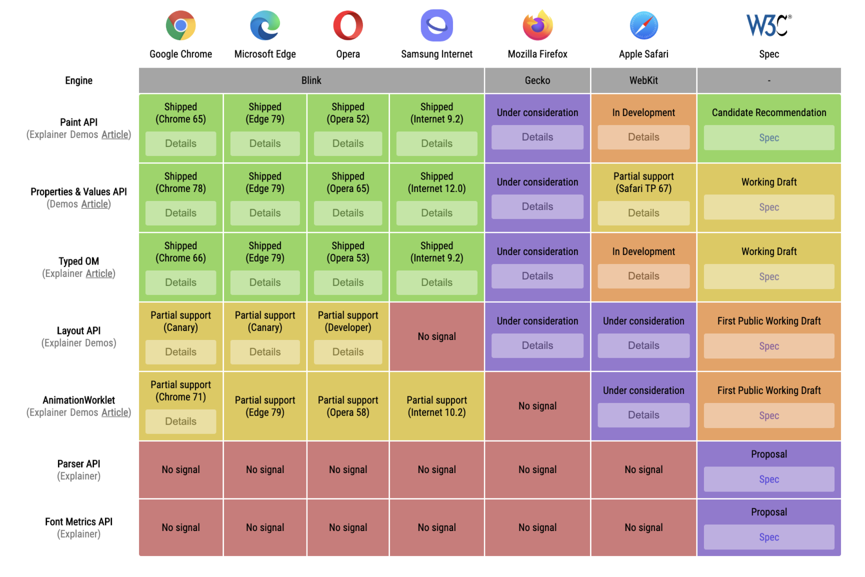
Discover cutting-edge CSS features like subgrid, container queries, and the :has() selector—tools that are reshaping how we structure layouts, enhance interactivity, and build modern websites.
a. CSS Subgrid
CSS Subgrid allows nested grids to align with parent grids, enabling more consistent and precise layout structures across components.
Benefits:
- Enhances layout consistency in complex designs.
- Eliminates redundant CSS rules.
Use Case: Aligning card components to a master grid in dynamic layouts.
.parent {
  display: grid;
  grid-template-columns: 1fr 2fr;
}
.child {
  display: subgrid;
  grid-column: span 2;
}
b. Container Queries
Container Queries allow elements to style themselves based on their parent container’s size, not just the viewport.
Benefits:
- Enables modular responsive design.
- Perfect for reusable UI components.
@container (min-width: 600px) {
  .card {
    flex-direction: row;
  }
}
c. CSS :has() Pseudo-Class
Enables parent selectors, allowing styles based on the presence of child elements.
Benefits:
- Enhances interactivity without JavaScript.
div:has(img) {
  border: 2px solid #00f;
}
d. CSS Houdini
Houdini exposes the CSS Object Model (CSSOM), allowing developers to create custom styles and behaviors.
Benefits:
- Unlocks low-level styling control.
- Enables truly dynamic CSS rendering.
e. Custom Properties (CSS Variables)
Variables in CSS now support dynamic theming, animations, and context-aware styling.
Benefits:
- Simplifies theming and maintenance.
- Works well with JavaScript and media queries.
:root {
  --primary: #1abc9c;
}
.button {
  background: var(--primary);
}
2. Responsive Design Techniques
Modern CSS makes responsive design more powerful than ever. With flexible grids, fluid typography, and smart media queries, developers can craft interfaces that adapt beautifully to any screen size.
a. Modern Media Queries
@media (min-width: 768px) {
  .layout {
    display: grid;
    grid-template-columns: 2fr 1fr;
  }
}
b. Grid and Flex Layouts
- Use
minmax()for fluid columns. - Combine
auto-fitorauto-fillwithrepeat()for flexibility.
.grid {
  display: grid;
  grid-template-columns: repeat(auto-fit, minmax(200px, 1fr));
}
c. Clamp() for Fluid Typography
h1 {
  font-size: clamp(1.5rem, 5vw, 3rem);
}
3. Animation and Interactivity
CSS animations bring life to interfaces without relying on JavaScript. From hover effects to complex motion sequences, modern CSS enables sleek interactivity and immersive experiences across all devices.
a. Keyframes and Transitions
.button {
  transition: background 0.3s ease;
}
.button:hover {
  background: #e74c3c;
}

@keyframes fadeIn {
  from { opacity: 0; }
  to { opacity: 1; }
}
.fade-in {
  animation: fadeIn 1s ease-in;
}
b. Scroll Animations
Combine with scroll-behavior: smooth; and position: sticky for smooth UX.
4. Performance Optimization
Efficient CSS is essential for fast-loading websites. Modern techniques like critical CSS, lazy loading, and minification help optimize performance, ensuring your site runs smoothly on all devices and networks.
a. Critical CSS
Load only above-the-fold CSS first, defer the rest.
Tool: Use tools like Critical npm package or PurgeCSS.
b. Minification and Compression
Always use tools like CSSNano or PostCSS for reducing file size.
c. Lazy Load Non-Essential Styles
Load non-critical CSS using media="print" onload="this.media='all'".
<link rel="stylesheet" href="styles.css" media="print" onload="this.media='all'">
5. Future Trends
The future of CSS is packed with possibilities. From advanced layout controls to API-level customization, new features are empowering developers to build smarter, faster, and more adaptable web experiences.
- Container Queries: Already in Chrome, coming to more browsers.
- CSS Houdini: Will change the way we interact with CSS internals.
- Native Masonry Layouts:
grid-template-rows: masonryis being explored. - Environment Variables: Like
env(safe-area-inset-top)for mobile-safe design. - Lightweight Themes with Custom Props: Fast theme switching via variables.
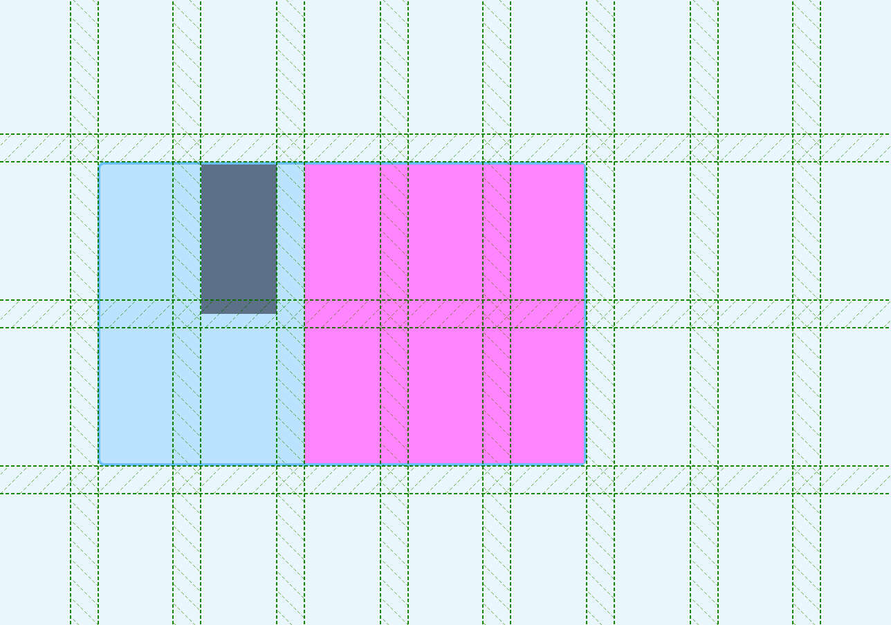
6. Visual Illustrations
Visual tools make complex CSS concepts easier to grasp. Diagrams, overlays, and interactive demos can help developers and designers better understand layouts, positioning, and responsive behaviors across devices.
- Use CSS Grid visual overlays (via DevTools) to teach layout structures.
- Create custom diagrams for flex alignment using SVG.
- Embed CodePen demos for live preview and interaction.
Conclusion
Futuristic CSS techniques are transforming static websites into responsive, animated, and user-first experiences. With tools like container queries, CSS Houdini, and subgrid, web designers now have superpowers that once required JavaScript. Embracing these innovations means building cleaner, smarter, and faster websites—ready for the demands of tomorrow’s digital world.
One team that stands out in implementing these advanced CSS capabilities is XHTMLTEAM. With deep expertise in modern CSS techniques and responsive frameworks, XHTMLTEAM delivers pixel-perfect, future-ready web solutions tailored to both performance and design. Their mastery in CSS Grid, animations, custom properties, and optimization strategies makes them a trusted partner for building innovative and scalable websites.
One thought on “The Future of Web Design: Advanced CSS Techniques”